My blog rebranding took some time to process. I’ve actually been thinking about it for at least 9 months.
Rebranding of any kind is not something that I would undertake without serious consideration. Any time you change something in your online presence, it shouldn’t be taken lightly. So I had a lot to consider before doing anything publicly.
Previously, It’s OK to be WEIRD has undergone 2 design changes.
It’s OK to be WEIRD! Design #1
My FIRST blog design looked like this:
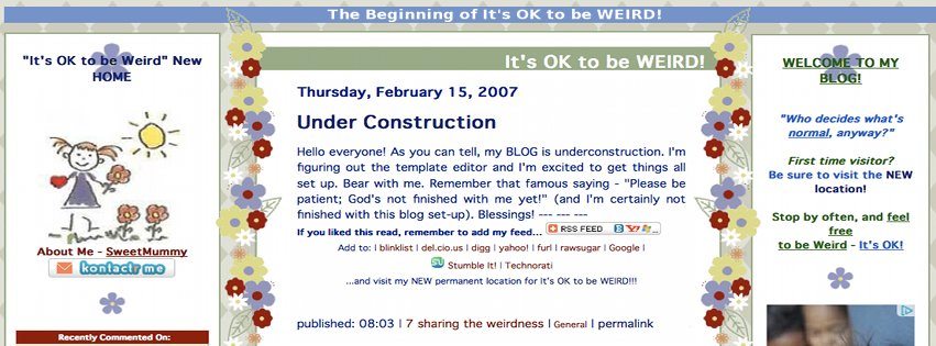
Flowers and Sunshine, with the crazy little stick figure girl.
 A good mix of colour, many similar colours to what I had most recently on the site. It was a little quirky, and very original at the time. It had some big bold headers with a nice mix of fonts/texts.
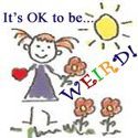
The Logo or Profile Pic for this blog looked like this:
That little stick girl is really cute. The font for “WEIRD” was a fun scrolly kind of writing, too, different from the rest.
It’s OK to be WEIRD! Design #2 – 1st blog rebranding
When I moved from my original non-standard blogging platform to Blogger, I went through a blog rebranding (mostly because my very first blog design wasn’t at all compatible with any other platform). I kept the same basic design when I transferred to WordPress.
So, most recently, my blog looked like this:
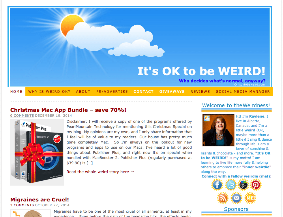
Things I loved about this theme:
- BRIGHT blue sky with sunshine.
- Sunshine icons everywhere
- Fun bright colour combination – light blue with gold, plus red and bright blue accents
- Fun details
- Cleaner, more professional than the first blog
For a profile photo or smaller logo space, I created and used this image:
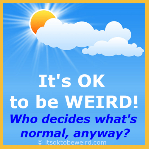
I LOVED this branding, but it didn’t fit the blog theme – WEIRD!
New Blog Branding Ideas
For the NEW Branding, I was looking for:
- BRIGHT COLOURS
- keeping the light blue and gold was something I seriously considered, to maintain some brand consistency even while making changes).
- UNIQUE
- it’s gotta be unique, different, weird, right? 🙂
- A Character?
- maybe something like the stick figure girl? As simple as a SMILIE face sunshine or something…
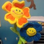 I kind of kept coming back to the idea of a SILLY FLOWER.
Flowers have always been part of my life and could fit well with the theme. I have 2 bendy flowers in my office – yellow and blue – and they inspired me.
This is the kind of information I gave to Eva (pretty_face) over at Fiverr to begin with my new logo design process.
It’s OK to be WEIRD! Design #3
Eva worked with me to come up with just want I wanted.
First version:
CUTE! Excellent start on the concept.
2nd version:
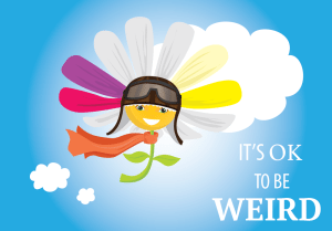
CUTER! Brighter! Better!
Final version:
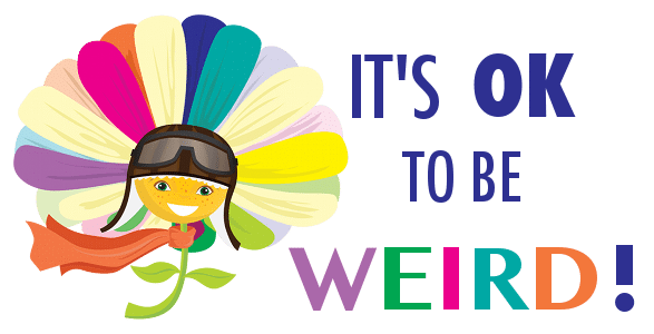
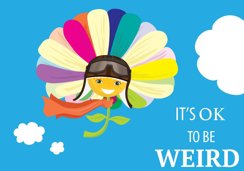
CUTEST!! Perfect! Fantastic!
Very representative of my theme, don’t you think?
I’ve tweaked the fonts a bit, but the flower is still the same.
I wasn’t sure how a Fiverr logo design would work out, but I’m really pleased.
The design elements that we incorporated really do reflect all the things I was hoping for my brand to represent.
Going with a new logo has allowed me to implement a new look without totally having to redo all the rest of my colours, as well as alleviating the need to rework the overall blog design. Changing out a few images is all that is needed at this time. It’s like a whole new-to-me blog, but without quite as much work as a totally new site design!
I feel that this unique flower girlie is a great addition to my brand and to the site. She’ll be showing up on all kinds of landscapes and backgrounds.
