Phase 2 of the rebranding for my blog is complete!
For a while now I’ve been wanting (needing) to spiff up It’s OK to be WEIRD! And I really wanted to come up with a character of some kind to fit my theme.
Rebranding Phase 1
Phase 1 included brainstorming with my kiddos about branding (homeschooling rocks!), and some initial sketches on some fun ideas we came up with. It was really a great exercise, and we learned a lot. (I’ll elaborate more on that in another post.)
I finally took my own best advice and hired someone to help me with the actual logo design. (Because the experts always do a better job!) I decided to use Fiverr to find my designer.
I chose a Canadian designer with lots of great feedback – pretty_face (Eva). She was fun, and great to work with!
Rebranding: Logo
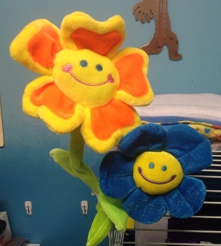 I started with the idea of those bendy flowers that have bright faces and you can twist them around to any position you want.
Eva’s first draft of my logo came along with the comment, “Hmmm…. this one wants to fly.”
And BOOM!!! It felt like she keyed on a HUGE part of the message behind the blog:
when you’re OK to be yourself (i.e., WEIRD) you are free to soar!
I wouldn’t have come up with this twist on my own, but it’s really fitting!! I’m very pleased!

Eva’s creativity and execution of a concept are really impressive. She took some basic thoughts on what I wanted and brought it to life. She was very receptive to feedback, and worked with me through a few modifications to really capture what I had in mind.
I have a feeling that my little flower will end up on many different backgrounds, as she flies around on her adventures. I’m probably still going to tweak things a bit with the fonts for the logo and the button, but for now, I think we’re off to a great start!
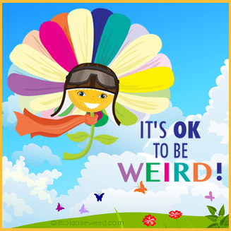
What do you think? How do you like the new look of “It’s OK to be WEIRD!”?


Love the new logo/branding
Thanks Lady Bren! I really like the way it turned out, too! 😀